Ever since I started looking closely at drawings deemed “master drawings” in the first drawings exhibition held at the Louvre in 1962, I have been fascinated by the implications of the power of a line. No matter what period, Renaissance, Baroque, 17th or 19th century, the artist can say volumes merely by a line in a drawing. It does not even need to be a line that is perfect. Frequently lines that are re-drawn, adjusted and reinforced are extremely powerful and eloquent. The line can whisper and hint, it can assert, it can describe, it can evoke or imply. A line, in essence, can take on a life of its own, transmit it to the viewer and empower a dialogue between image drawn and the viewer that can be subtle and long-lasting.
One of the earliest French drawings, A Young Woman in Profile, done in ink by Jean Hey, Maître de Moulins, about 1480, illustrates beautifully the power of a very precise line when delineating the eye and the mouth. Those lines tell you exactly how her eye looked in real life, how her mouth set in determination yet reticence - beautifully contrasted by the almost dotted, quick lines of her hood or cape that complement the facial tight detail. (Sadly, the only digital image I can find is not marvellous in quality.)

Profile of a Young woman, Jean Hey, Maitre de Moulin, c. 1480, image courtesy of the Louvre, Paris
Look then at Albrecht Dürer’s 1520 black chalk Portrait of Erasmus. Follow that wonderful, sensuous, assured line of his hat on the right hand side as it swells and flows into nothing, his second attempt at it as you can see from the faint lines beyond. You can touch that felt, feel its weight and texture, sense the thoughtful head it encases.
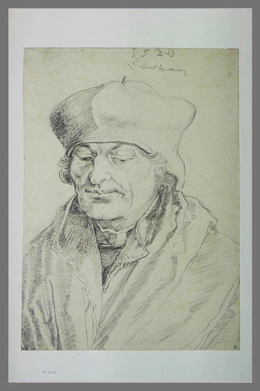
Portrait of Erasmus, Albrecht Durer, 1520, image courtesy of the Louvre, Paris
An earlier c. 1460 silverpoint drawing by Rogier van der Weyden, which I saw again recently in the wonderful Drawing in Silver and Gold metalpoint exhibition at the British Museum, is the essence of refined lines. This “Head of the Virgin” is an idealized image of extraordinary delicacy. It may be related to a number of paintings by van der Weyden, notably the "Virgin and Child" formerly in the collection of the Prince of Furstenburg, in Donaueschingen (private collection). Look at the fine, firm line delineating the right side of her face, perfectly contrasting, across the hatching on the face, to the utterly simple but descriptive lines showing her veil covering her soft hair. The focus of all the lines is her eyes and their soft, almost dreamy expression, hinting at the extraordinary future she contemplates.

Head of the Virgin, Rogier van der Weyden, silverpoint, image courtesy of the Louvre, Paris
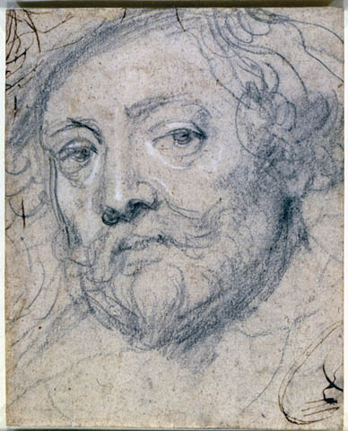
A total contrast is the use of line by Peter Paul Rubens, an extraordinary, almost flashy draughtsman. Two self-portraits are fascinating in the use of descriptive shorthand lines. Honest, simple and powerful, each black chalk drawing, the first done as a study for his 1623 self portrait painting and the second done in old age, between 1633-1640, the lines flow easily, powerfully. In the first, he distinguishes wonderfully between the texture of hair, thick woolen coat and the stylish hat. In the later one, the lines are even faster, more economical, more acknowledging of age and its untidiness.

Self Portrait, Peter Paul Reubens, image courtesy of the Louvre, Paris
Peter Paul Rubens (Flemish, 15771640) Self-Portrait in Old Age, 163340 Black chalk, heightened with white, on oatmeal paper, pen and brown ink lines at top left and bottom right corners 200 x 160 mm (7-7/8 x 6-5/16 in.) Lent by Her Majesty Queen Elizabeth II, Royal Library, Windsor Castle 6411 (recto)
His contemporary, Rembrandt van Rijn, was another master of line, in so many media. This double study of a Bird of Paradise, in ink, bister and white gouache, one of his rare studies of birds, was probably done in 1637-1640. Again, each line tells its story – you can gauge the weight of each feather, feel its texture, touch the beaks in their hard shininess. Yet if you analyse the lines, it is a series of wavy lines, squiggles and smudges, put down fast and with the sureness of hand of a master.

Two Studies of Bird of Paradise, Rembrandt, image courtesy of the Louvre, Paris
I am jumping from century to century, but the lines are just as wonderful. Look at Jean Auguste Dominique Ingres’ extraordinary pencil portrait of the violinist, Paganini, done in 1819. Tiny, tight, almost intellectual and yet so free, it tells you so much about this famous musician. Ingres was such a master draughtsman. I found a wonderful quote by Sanford Schwartz in The New York Review of Books about Ingres’ drawings that bears repeating: “The figures in his pencil portraits created out of controlled maelstroms of ethereally soft shading, vigorous darting marks, and powerfully assured and sinuous repeating lines seem more forthrightly present than the sitters, not only in earlier drawings but also in the drawings of any era. Ingres made sitters more physically tangible and psychologically present than they had perhaps ever been in the tradition of portraiture. He created one rounded, fully autonomous character after another, resulting in an array of personalities who, in a flowing organic way, sum up an entire era.”
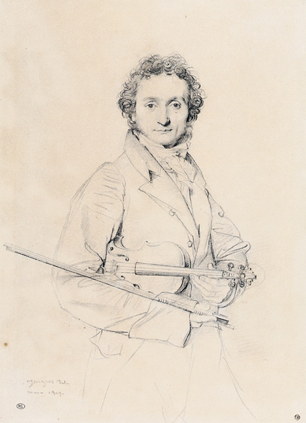
Paganini, pencil drawing by Jean Auguste Dominique Ingres, 1819, image courtesy of the Louvre, Paris
And then to another approach to line: Edgar Degas’ sensuous handling of line. Two studies he did in lead pencil and black crayon for his compositions of the Malheurs de la Ville d’Orléans. One, vertical, is a study for the woman attached to a tree, the other for a reclining nude. The standing nude, whose upstretched arm has been adjusted and re-adjusted, is tautly contained inside those strong outlines. Yet look at the flicks of the pencil that describe the contours of the face and especially the folds in the straining bent neck. Or the hair, which feels damp, man-handled, abused. Degas’ use of line is so spare yet so descriptive.
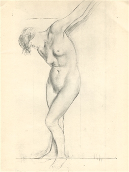
Nude study for Les malheurs de la Ville d'Orleans, Edgar Degas, image courtesy of the the Louvre, Paris
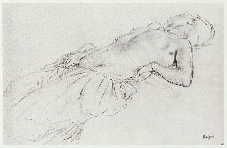
Nude study for Les malheurs de la Ville d'Orleans, Edgar Degas, image courtesy of the the Louvre, Paris
Even when Degas is almost drawing in flat planes, as he is basically doing in Young Woman knotting the Ribbons of her Hat, his swift charcoal strokes are wonderfully varied and vigourous. Again, he alters lines, but each repetition of contour strengthens the drawing and gives a sense of movement and balance. The lines are economical yet totally complete in their descriptions.
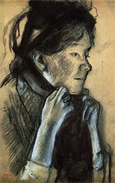
Young Woman tying the Ribbons of her Hat, Edgar Degas, image courtesy of the Louvre, Paris
These images about which I have been writing all came from that first 1962 Louvre exhibition – I have remembered and marvelled at them ever since. It just shows how powerful and memorable a beautifully drawn line can be.