From his early exposure to Cubism and Fauvism, Hans Hoffman evolved through a lifetime of experimenting in painting to an extraordinarily inventive approach to creating art that is often as relevant today as it was when it was created in the 1960s. Seeing his evolution in the large exhibition, ”Hans Hoffman - The Nature of Abstraction” at BAMPFA, Berkeley, reinforces my own belief in each artist’s need, and capacity, to remain open and flexible to growth and change.
Read MoreColour
A Gift of Colour and Light /
The Mayo Clinic in Jacksonville, Florida, is a place of such contrasts. Dread and hope, anxiety and tranquility, fears and laughter. Yet it is often a vessel of transformations and healing alchemy.
There are sculptures gracing the lawns, fountains play in the different lakes, live oak trees shade camellias in bloom - all help calm and center the visitors to the Clinic.
There is, however, an even more beautiful gift of colour and light at the moment, in the Mayo building, en route to the hospital. It is a small exhibition of work by the Scottish Colourists, owned and lent by the major Mayo benefactors, Isabelle and Robert Davis.
I have always loved the bold, elegant work of the Scottish Colourists, a small group of artists who included Samuel John Peploe(1871-1935), John Duncan Fergusson(1874-1961), Francis Campbell BoileauCadell (1883-1937) and George Leslie Hunter (1877-1931). They achieved a wonderful fusion of French artistic influences that ranged from Manet to Cezanne and Gauguin, in composition, brushwork, colour and their choice of humble everyday objects that became monumental. Post Impressionist in their approach, they all worked together, often travelling to different locations to work as companions. Fergusson and Hunter were essentially self-taught, while the Academie Julian in Paris played an important role in their collective development, along with the artistic ferment of early 20th century France, where Matisse, Picasso or the Fauves were supplanting the Impressionists.
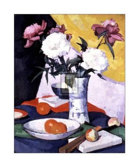
Still life - Peonies and Fruit, Samuel John Peploe
Whilst he painted many landscapes, Peploe loved to paint still lifes, such as this Peonies and Fruit, one of his many carefully arranged compositions. "There is so much in mere objects, flowers, leaves, jugs, what not - colours, forms, relations" he said. "I can never see mystery coming to an end."
Fergusson was also very much influenced by Manet and even Velazquez. He was a pivotal figure amongst the Scottish quartet of artists, and he in turn influenced other artists such as the young American artist, Anne Estelle Rice, (1877-1959), who had been trained at the Pennsylvania Academy of Fine Arts, before coming to Paris.

Anne Estelle Rice, drawing, John Duncan Fergusson
Fergusson painted some fine portraits of Rice; this is a drawing he did of her in preparation for a painting. She too produced some wonderfully strong and simple still life paintings, such as the one displayed at the Mayo, Still Life with Dahlias.

Anne Estelle Rice in Paris - Closerie des Lilas, 1907, oil on canvas, John Duncan Fergusson

Still Life, oil on canvas, Anne Estelle Rice
Her friend, Fergusson, produced a huge body of work: at a 1961 memorial exhibition, his artist friend, André Dunoyer de Segonzac, wrote, ""His art is a deep and pure expression of his immense love of life. Endowed with a rare plastic feeling, almost sculptural in its quality. he joined with it an exceptional sense of colour, outspoken, ringing colours, rich and splendid in their very substance." This late painting is a perfect example of his love of life.

The Red Sail, oil on canvas, John Duncan Fergusson
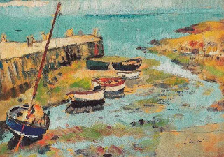
Frank "Bunty" Cadell studied in Paris and became noted for his portraits of glamorous women. He returned to Scotland, where he discovered the island of Iona, an important turning point in his development as an artist. He served in world War I, as did his fellow Scottish Colourists, and he reacted to the horrors of war with optimism and heightened joie de vivre, both of which were reflected in his subjects and the joy with which he painted them. He returned often, after the War, to his utopia, Iona, where he summered, alone or with Peploe in 1920. A fellow artist noted, "It seems to me more than ever clear that your forte lies in a gift of colour and light." The joyous mid-1920s painting above of Iona would bear out that statement.

Iona, oil on canvas, Frank "Bunty" Cadell
George Leslie Hunter moved from Scotland to California with his family as a young boy, but as an adult, he spent time in Scotland, France, Italy and America. He was recognised early on as a skilled draughtsman and drawing remained one of his great strengths. Like Cadell with Iona, Hunter found Largo, in Scotland, to be a place of great inspiration, as is shown in this painting. He was also noted for his treatment of light and sense of colour.
Lower Largo, George Leslie Hunter
The Davis collection of Scottish Colourists being shown at the Mayo is also rounded out beautifully by exquisite canvases by three artists who had links to the Scottish Colourists - Anne Estelle Rice, the American artist whom Fergusson both encouraged and celebrated in portraits.
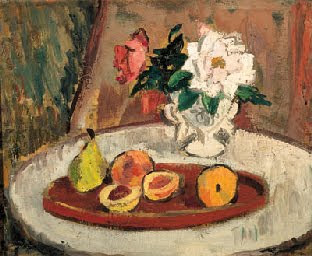
Still life with fruit and flowers, Anne Estelle Rice (recently sold at Sotherbys)
Another Scottish artist, Anne Redpath (1895-1965), was a student of the Scottish Colourists while she was studying in Edinburgh. She later moved to the South of France with her husband where they became part of the Scottish Colourists circle. In her work, she was, to an extent, one of their heirs, being especially influenced by Peploe and Cadell.

Flowers on a White Table, Anne Redpath (Image courtesy of Portland Gallery)
Her celebration of familiar household objects in her still lifes and her use of colour harmonies of cool contrasting with warmer hues were hallmarks of her work. This wonderful flower study, Flowers on a white tablecloth, was in her collection at her death.
The last artist represented in the Mayo exhibition was a British artist, Robert Bevan (1865-1925). The link with the other Scottish artists was that he too studied at the Academie Julian in Paris. He also spent time in Brittany and was linked to the Pont-Aven school of artists who were experimenting with the use of colour and form. During his life, his work was considered controversial and too avant-garde, with one critic labelling his use of colour "garish". However, by the time he died in 1925, he was celebrated in art circles and hailed for his "modernist powers".

Near Applehayes, Robert Bevan
By the time I had finished savouring of the beautiful and interesting exhibition in the Mayo building, I had become sadly aware of how many preoccupied people had hastened past this gift of colour and light. All I can hope is that they will find a moment of peace and delight the next time they pass that way. They would be rewarded.
Intersecting Clothes and Art /
I recently saw a wonderful production of Sleeping Beauty by the Moscow Ballet in Palma de Mallorca. It was a delight to see, for the quality of dancing was extremely high. One of the most interesting aspects, however, was the brilliant colours of the otherwise traditional costumes. I don't recall ever seeing such "technicolour" dresses and tutus, ranging from the most vivid wisteria mauves to turquoises, blues and citrons. It made for a vivid and arresting mixture with the dancers' skills, the pure lines of arabesques and the sense of movement in space.
I could not help but think that today's omnipresent brilliance of colour in television, on the web and everywhere else has an influence on such choice of colours for the costumes. We have all become accustomed to colours that are accentuated, often far beyond Nature's version of these colours. I find it interesting to see the same influence in art; with the ever-extending palette of colours in oils, acrylics, watercolours, a dazzling intensity of colour is easy to achieve. And, conversely, art produced in a "lower register" often appears dull and less noteworthy to the average viewer. For the most part, we do not seem to live in an age of subtlety.
While I was thinking about this role of colour in our current world, I fell on a fascinating article in CAM, the Cambridge Alumni Magazine for Lent 2011, entitled "A Sense of Proportion", a fellow at St. John's College, has published a book on "Dressing Up: Cultural Identity in Renaissance Europe" (Oxford University Press). In it, she states that "Clothes to me are no different from art in our contemporary sense of a human assembly of form. Clothes are rich in categories of visual interest and tell us so much about the peculiar sensibilities of an age. Their study can bring a fresh focus to the Renaissance and our own time."
Dr. Rublack talks of how the Renaissance was a time when not only was there an amazing influx to Europe of rich fabrics and furnishing as trade routes opened more and more to the Far East, but also an era when artists were increasingly depicting humans in paintings, sculpture, medals. Mirrors were also more and more available. How a person looked to the outside world became of great concern and interest. The author cites as a wonderful source of insights on this evolving sense of self, an album of watercolour paintings of MatthäusSchwarz, chief accountant for the Augsburg powerhouse Fugger family of merchants and bankers. The image at right was painted in 1517, showing him with Jakob Fugger. He lived from 1496 until 1564, so he was able to savour of all the energies and fashions in art and self-images that the Renaissance brought to Europe.

Office of Jacob Fugger; with his main-accountancy Matthaus Schwarz, from biography of M. Schwarz; Herzog-Anton-Ulrich-Museum Braunschweig
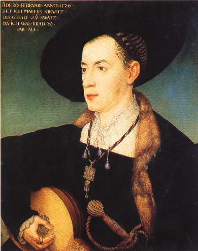
Portrait of Matthäus Schwarz by Hans Maler zu Schwaz, 1526, Musée du Louvre
In July 1526, at aged 29, Schwarz commissioned the first portrait of himself, nude and slim. He went on to commission 135 more paintings of himself, dressed in many a garb as befitting the overt or subliminal messages he wished to covey to those who saw him or his painted image. They depict himself through his long life.

Matthaus, aged 19, A typical page from the Trachtenbuch.
The images are wonderfully varied and let one savour of everything from his fencing outfit, with differing hose, to his sweeping hats and expensive fur collars.

Schwarz, Matthäus, Trachtenbuch des Matthaus Schwarz aus Augsburg,
In others, Schwarz carried green heart-shaped leather bags when he went out to court a lady - green being the colour of hope.

Matthaus Schwarz from behind
At aged 41, his courting days were suspended, as he records on this image of himself from the rear. He wrote "20 February 1538, when I took a wife, this coat was made". No mention of his amazing scarlet hosen!
Matthäus Schwarz' Book of Clothes or Klaidungsbüchlein is now held in the museum in Brunswick, Germany. A version of it has been published in French as "UnBanquiermis à nu".
My musings on the brilliant costumes in Sleeping Beauty are just a reminder that colour has long played a key role in our perceptions of the human body, its sartorial role in different cultures and its use for different messages. Art has been an integral part of that conversation.
Colour in art, colour in our eyes /
The Louisiana Museum of Modern Art in Humblebaek, Denmark, has just opened an exhibit entitled Colour in Art. They combined works from their own collections with others lent by major collectors, Werner and Gabrille Merzbacher, to explore the role of colour in art and thus in daily life.
Colour underpins most artists' concepts in some form or another. The most obvious domain of colour in art is in paintings, done in many media. The perception of colour has changed considerably over the last 150 years or so, as societies and cultures have evolved. There has also been a huge evolution in the actual production of pigments and types of paint, which have increasingly allowed more brilliance and a more flexible approach to the creation of art.
Colour choices can be very personal, as we all know from the famous example of art to match the sofa demonstrates. Every choice we make in decorating our home is involved with colour in some way or another. So it is is no surprise that for an artist, the absence of colour (in a monochromatic work) or its presence - and in what fashion - both dictate a great deal about the creation of that particular work of art. Once created, artwork will then appeal to people through the colours used, to a great extent, whether the collectors and viewers realise it or not. Moods are created through a certain spectrum of colour, and people respond to those harmonies, even if only subliminally.
The Fauves - Andre Dérain, Henri Matisse, Raoul Dufy, Albert Marquet and others - used a bright, almost strident palette of broken colour to evoke the brilliant light and intensity of colour in the landscapes of the French Mediterranean coast. Nothing downbeat at all. By contrast, Picasso's Blue Period paintings are almost monochromatic and convey deeply gloomy and sombre sentiments. Picasso's close friend, Carlos Casagemas, had committed suicide in Paris in 1901. This affected Picasso deeply, and the resultant paintings of that period use colour to convey the melancholy and resignation he experienced.

Pablo Picasso, Self-portrait, 1901, (Image courtesy of Musée Picasso, Paris)
The exploration of colour intensified as the artists of the mid-19th century began to move outdoors from their studios (mostly set up with northern constant light). They then got all excited about conveying the brilliance of light and its ever-changing qualities, when they worked plein air. After the Impressionists had pushed out the boundaries of colour use and perception, the field was wide open for everyone to experiment. Thus the Fauves and everyone else who followed, up to our time.
Meantime the development of new artificial pigments, types of paint binder and their presentation in the marketplace were following a parallel explosion. This is explored in the Louisiana Museum show, Colour in Art. There is also the interesting dimension evoked of the commercial use of colour, for logos, advertisements, etc., and the same colours used in art. As is cited in the article on this exhibit on ArtDaily.org, the blue which Yves Klein developed for his famous brilliantly intense canvases would be unlikely to be confused with the blue used in the logos and names of the United Nations, the European Union or even Nivea cream. In other words, context of culture influences our perception of colour. I am sure that in our digital (and globalised) age, where colour is intensified even more than previously, even cultural perceptions are constantly evolving.

IKB 79. 1959, Yves Klein, (Image courtesy of the Tate)
Nonetheless, there is another dimension to colour, particularly in art. I found it an interesting juxtaposition to read about the Colour in Art exhibition and very soon afterwards, to find the following quote by Marc Chagall on Renée Phillips' Manhattan Arts International website: "In our life there is a single colour, as on an artist's palette, which produces the meaning of life and art. It is the colour of love (my emphasis)".
Something for us to think about.
As we move into 2010 in the art world /
Happy New Year to everyone! May 2010 be a wonderful year for all.
As I watched the New Year come in under a brilliant full moon shining over Palma de Mallorca, I could not help but think that this decade would probably be as full of radical changes in the art world as in all the other domains, be they financial, technological or environmental.
Each of us, as artists, is constantly trying to think of new and better ways to approach the creation of art. However, one of the most interesting - and metaphorically eloquent, perhaps - ways of creating art has been flowering in the United States and and further afield: the framed reproduction of your personal DNA. On sale on the Net, adorned with jewels or other items to your taste, the DNA picture seems to me to be emblematic of our lifestyle tastes of today. Good or bad - who knows? It is certainly a very personal piece of art that you can put on your walls.
I was looking at an example of this art in an illustration I saw in the Diario de Mallorca last week, and could not help thinking of Josef Albers and his use of colour theory.

Formulation Articulation I & II, 1972, Josef Albers (Image courtesy of Phillips)
Perhaps the DNA pictures could be allied to his sense of colour. The history of colour theory is enough to make any artist dizzy, but it does reward by study! Not only the history of the use of colour, but the history of paint pigments themselves make for the most fascinating reading. Having wandered into the world of pigments, artists often then get totally hooked on learning more of the dramatic stories behind the pigments' productions and discoveries. An enthralling book which I read when it came out in 2001 is Bright Earth. Art and the Invention of Color by Philip Ball, published by the University of Chicago Press. Having learned about pigments' histories, I had a far better appreciation not only of the paints I use when I am painting in watercolours, but every painting I view in a museum has an additional layer of interest as I look at the pigments the artist used.
I wonder if that will be said, ten years hence, of the DNA pictures that are increasingly adorning people's walls. Any bets on this aspect of the future art world?
Playing in art - revisited /
I talked in an earlier blog about the insights into the value of play in our daily lives and the role that play has in allowing artists to develop and create. I was reflecting again on the way artists can play in creating art, and realised that there is another aspect to this activity of play.
When I am drawing or painting, a private game that I play with myself is seeing how I can convey the essence of my perceived reality - be it landscape, flower, person - with the minimum of lines (in drawing) or colour (in painting). I try to distill the subject to the absolute minimum of detail which still allows the viewer to recognise (more or less!) what is being portrayed. Each work is an endlessly interesting challenge in this respect. Organising abstraction as visual elements that convey reality is really a game to see how best one can succeed in minimalist depiction of the subject matter. Artists have done this since time immemorial - think of the essence of bison galloping across the walls of Altamira or the aurochs of Lascaux. Dolphins cavorting across the frescoed walls of Minoan palaces and octupii reaching around their painted ceramic jars come to mind too. In all these cases, the imagery is distilled and organised almost to the point of abstraction, yet utter realism results - powerful, arresting and memorable.
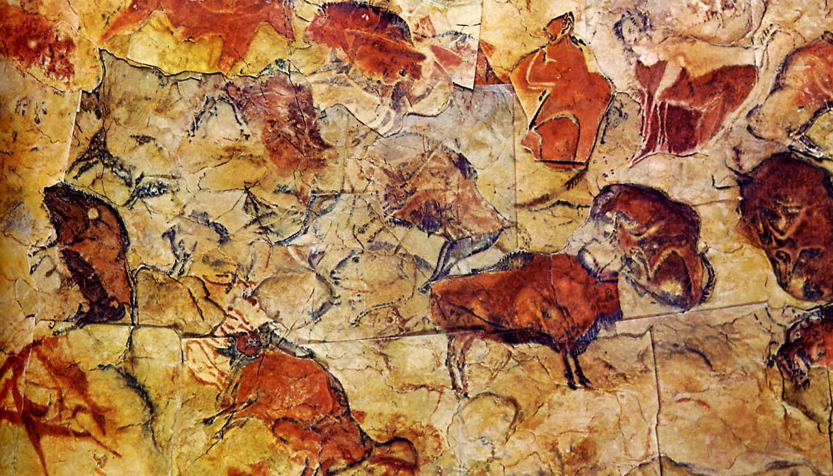
Altamira Caves, rupestrian art

Dolphin Fresco, Knossos, Late Minoan Period (ca. 1500 BC)
Old Masters, from Renaissance times onwards, also skilfully selected and simplified design elements to make their compositions more successful and beautiful. They used the abstraction of closely related values joined together in massed forms, which allowed the viewer's eye to be led to the focal points which are depicted realistically. Abstraction was certainly not the "invention" of the 20th century. If you carefully study any good drawing or painting, of no matter what era, that is purportedly realistic, you can see all sorts of amazing elisions, squiggles, blobs and lines that seem to have nothing to do specifically with the subject being depicted. Yet, when looked at as a whole, the art is convincing. I am sure, too, that the artist was probably having fun and enjoying playing as the work progressed.