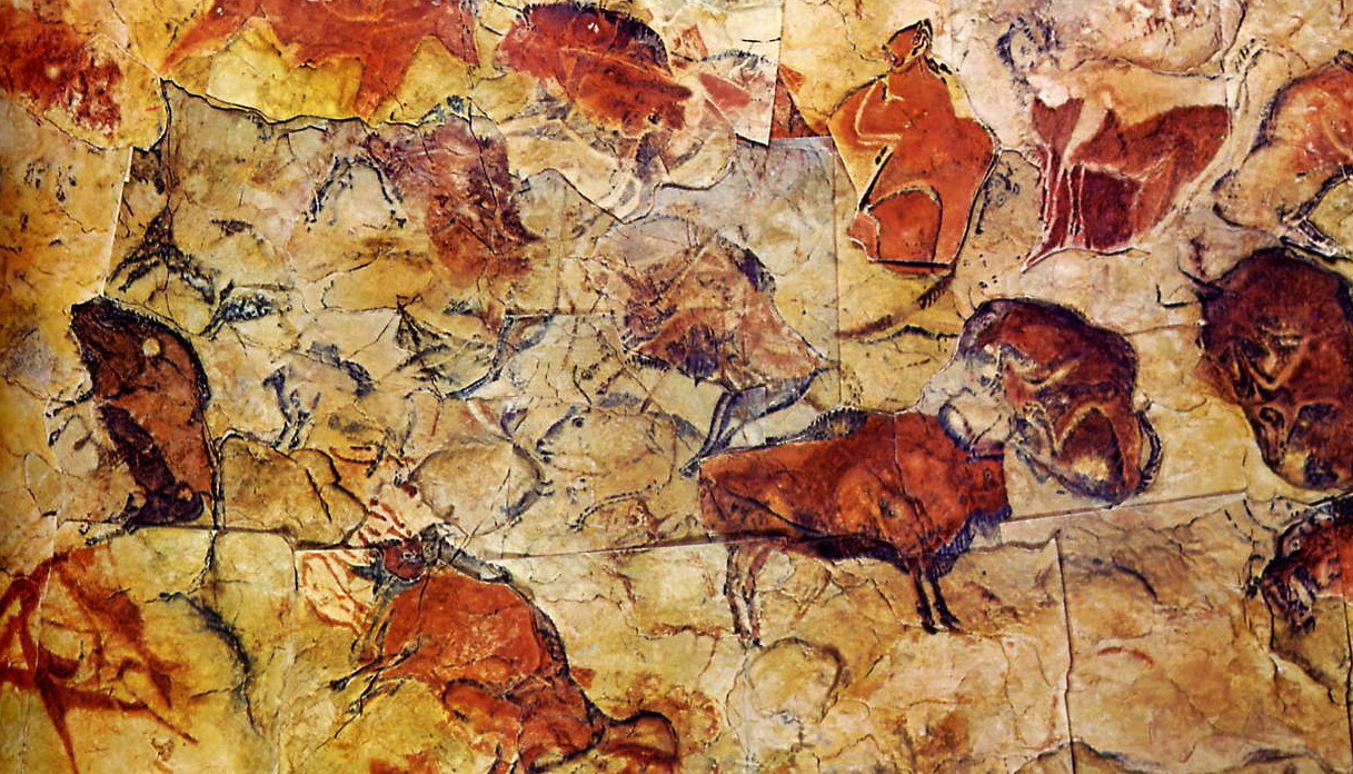
We artists have all faced the blank sheet of white paper or canvas, time and time again. It can be a daunting moment. Yet it can also be the start of a fascinating balancing act, whose dynamics hark back to the earliest cave drawings, the origins of calligraphy and the vast heritage of both Eastern and Western art-making.

"Tabula rasa"
Some while ago, I found a marvellous statement by the wonderful British artist, Rebecca Salter,about the state of a piece of paper. She talked of an old Chinese saying that "a piece of paper is not empty until you have made the first mark", a saying which underlines the dynamics between a mark that you make on that paper and the blank space around it. She continued by saying that "the word 'blank' is, however, misleading as the space, instead of becoming a space of nothingness, is 'activated by the presence of the drawn or painted mark".
This concepts seems to go to the very heart of composition, of a sense of balance and fitness of the symbiotic relationship of the marks placed on that surface. It also ensures that your particular style, your hallmark as an artist, will be evident from the dynamics of your choices of marks made on that blank sheet of paper.
Calligraphy, from all traditions, has been based on this concept of dynamic balance on the page.

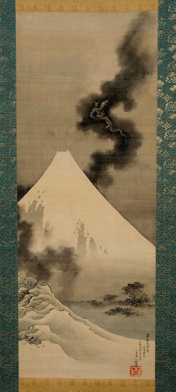
Japanese calligraphy
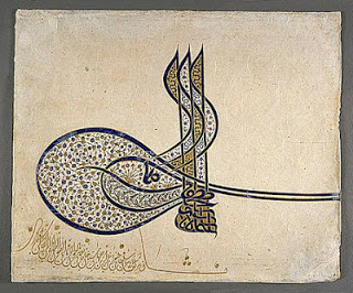
Ottoman tugra of Suleiman the Magnificent,1520, with flowers and saz leaves
Present-day Western calligraphy
These examples from different types of calligraphy are wonderful examples of the dynamics that can be created on a black piece of paper. However, we can all be mindful of those potential relationships that we can work with when we face that sheet of paper.