Transformations from the object an artist is viewing to the art created always seem like magic. No matter how lucid an explanation is given about how the artist gets from point A, the subject matter, to point B, the resultant artwork, there always seems to be another dimension. Perhaps that is because none of us can really get into the head of another human being, no matter how. Each of us is that proverbial "island unto ourselves" and that includes the conscious or subconscious process by which art is created. Of course, there is that other aspect - that the art that happens is also somewhat of a mystery to the artist as well. Each artist really never knows what is going to happen during the art-making process, no matter how carefully the preparation is done, or how meticulously laid out the plan for the work.
Personally, I am learning, slowly, simply to trust that small voice inside my head that says, "look hard at what you are seeing, allow your eye to select the next aspect to draw or paint, and just go with the zeitgeist of that moment of creation." In other words, relax, don't think too hard and work intuitively as much as possible. I have also come to realise, with time, that whether I like it or not, my life experiences, my personality - who I am - will come through my art, for good or for bad.
I was trying simply to live intuitively in the moment last week when I had one of my rare, precious times to draw en plein air. I found an amazing live oak "sculpture" of the remains of a mighty tree - just the stump, the essence of sinews and strength.
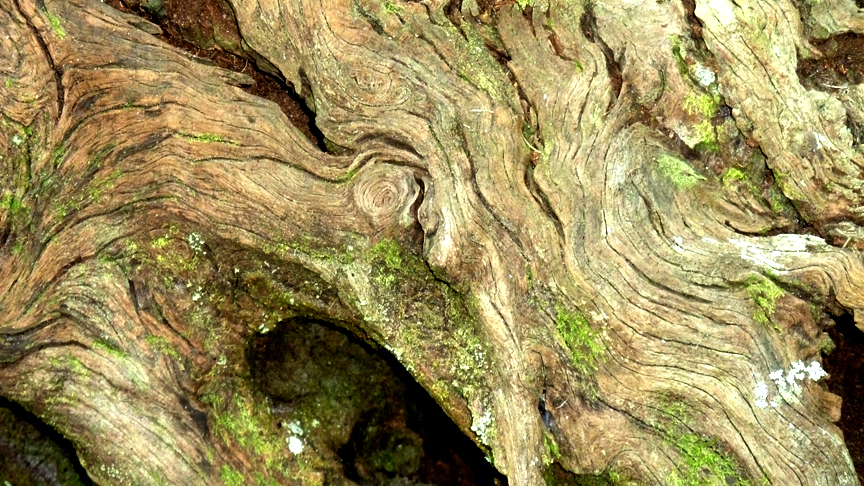
Live Oak Tree Stump I, photographer J. Cook
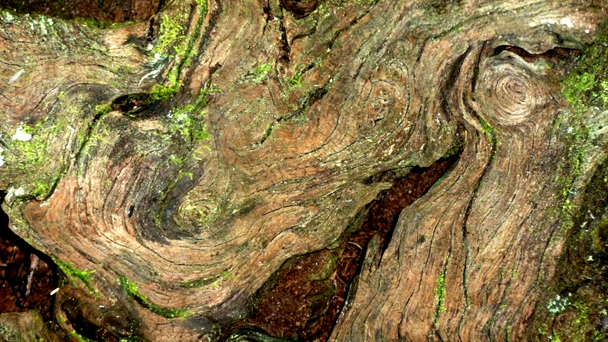
Live Oak Tree Stump II, photographer J. Cook
The sunlight was shining on parts like a floodlight, and they sang. The only trouble was that of course, the sun moved, the light changed and other parts began to be more visible and the aspects that had interested me simply faded into shadow! Paciencia, as the Spanish say!
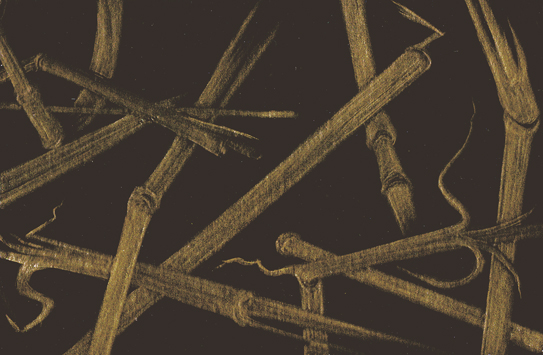
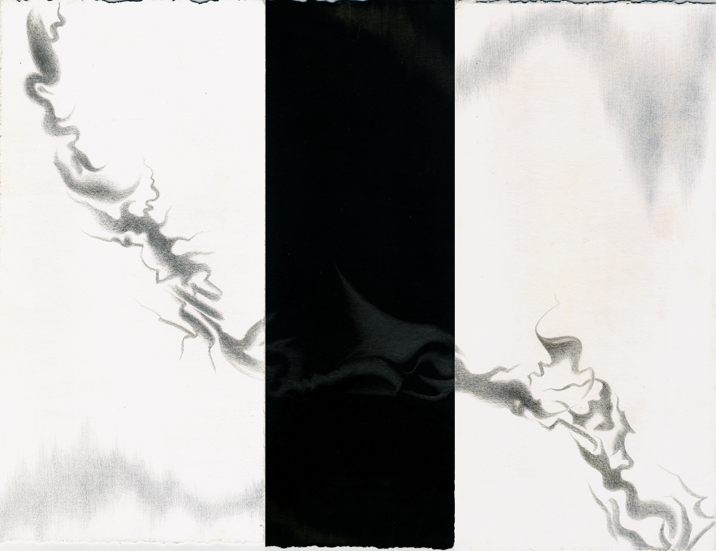
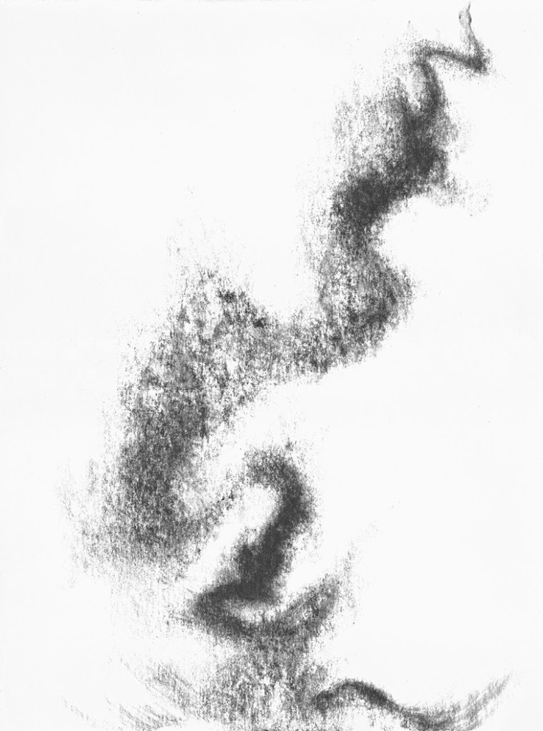
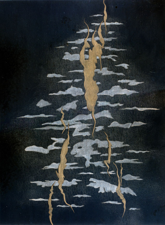
Nonetheless, by the end of the time spent in peace and fascination, I had done some small metalpoints. They are a version of this mysterious alchemy of transformations.

Rhythms of Oak, silverpoint-Prismacolor, artist Jeannine Cook

Live Oak Lingering, gold-silverpoint, artist Jeannine Cook