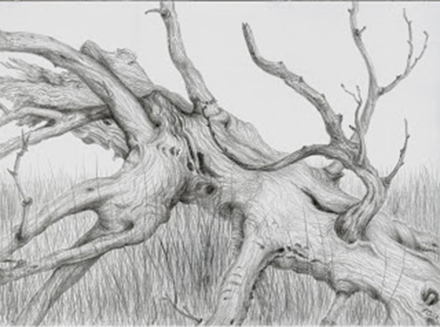
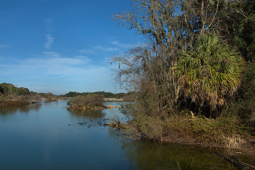
Yesterday, the golden spring light invited us to visit the Harris Neck National Wild Life Refuge in McIntosh County. This small and diverse refuge has been protected since 1962, and it evolved from being a World War II airfield, with long tarred runways. Now it is a fascinating area of ponds which are home to many species of herons, egrets, wood storks, ducks, coots, turtles and alligators large and small. Beyond are areas of maritime forest, and an amazing area of tarred runways now crazed with cracks through which cacti, grasses and trees are inexorably forcing their way as nature reclaims dominance.

Wood Storks ,Mycteria americana, Building Nests Rookery, Harris Neck National Wildlife Refuge NWR, McIntosh County GA (Image courtesy of Brian Brown)
To me, as an artist who tries frequently to direct my energies to creating art that makes people aware of nature's complex beauties and importance, Harris Neck is the perfect example of undoing man's abuse (justified or not) on nature. Cicero said in his Second Philippic speech in 44 B.C. that "Destroyers of the forest are enemies of the public weal". For the last century and more, we have witnessed at an ever-increasing rate the destruction of forest and the environment in general. This assault on "the forest" makes federal, state and local protected areas all the more important for everyone.
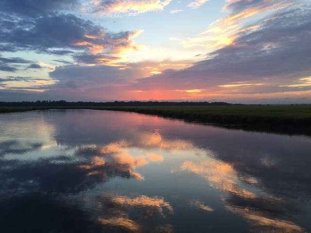
Woody Pond Habitat with Palm Tree Harris Neck NWR McIntosh County, GA (Image courtesy of Brian Brown, photographer)
The efforts of artists of all stripes to help people understand and appreciate the magical beauty of such areas and their value to society are important. Drawing, painting photography and film, music, sculpture temporary and permanent, poetry and writing : all these disciplines are vital in this never-ending need to alert people that we must all, throughout the world, push back the "destroyers of the forest" and protect nature. The "public weal" demands nothing less, and I for one, as a visual artist, think it is a privilege to depict aspects of coastal Georgia's natural beauty. Harris Neck's magic reinforced my feelings as we visited it yesterday.