Whenever I paint a watercolour, I then record it in digital fashion and, frequently, I continue to use up my stock of Kodak ASA25 35mm slide film as I am still straddling the two systems. I far prefer the Kodak version because the slide film is superior for colour rendition on most watercolour paintings. As long as I use a grey card, a tripod and a decent camera, I can pretty well ensure decent photographs - the old-fashioned way.
Photographing digitally is another subject altogether and I know reams have been written about how to take good digital photographs of paintings. My personal experience is that the surface of most cold pressed watercolour papers bounces the light all over the place and consequently, photos come out pallid and with very unimpressive colour fidelity. I usually only photograph big watercolours, and then resign myself to a long session in Adobe Photoshop, with the painting beside me to guide me back to colour accuracy.
For smaller works, both watercolours and silverpoint drawings, I have been using a flatbed scanner for ages. I had a really good Epson scanner (courtesy of my husband's careful choice), but alas, it gave up the ghost and I had to replace it. Now I have a large format Mustek scanner installed, and it does help that I don't have to knit so many images together from several scans.

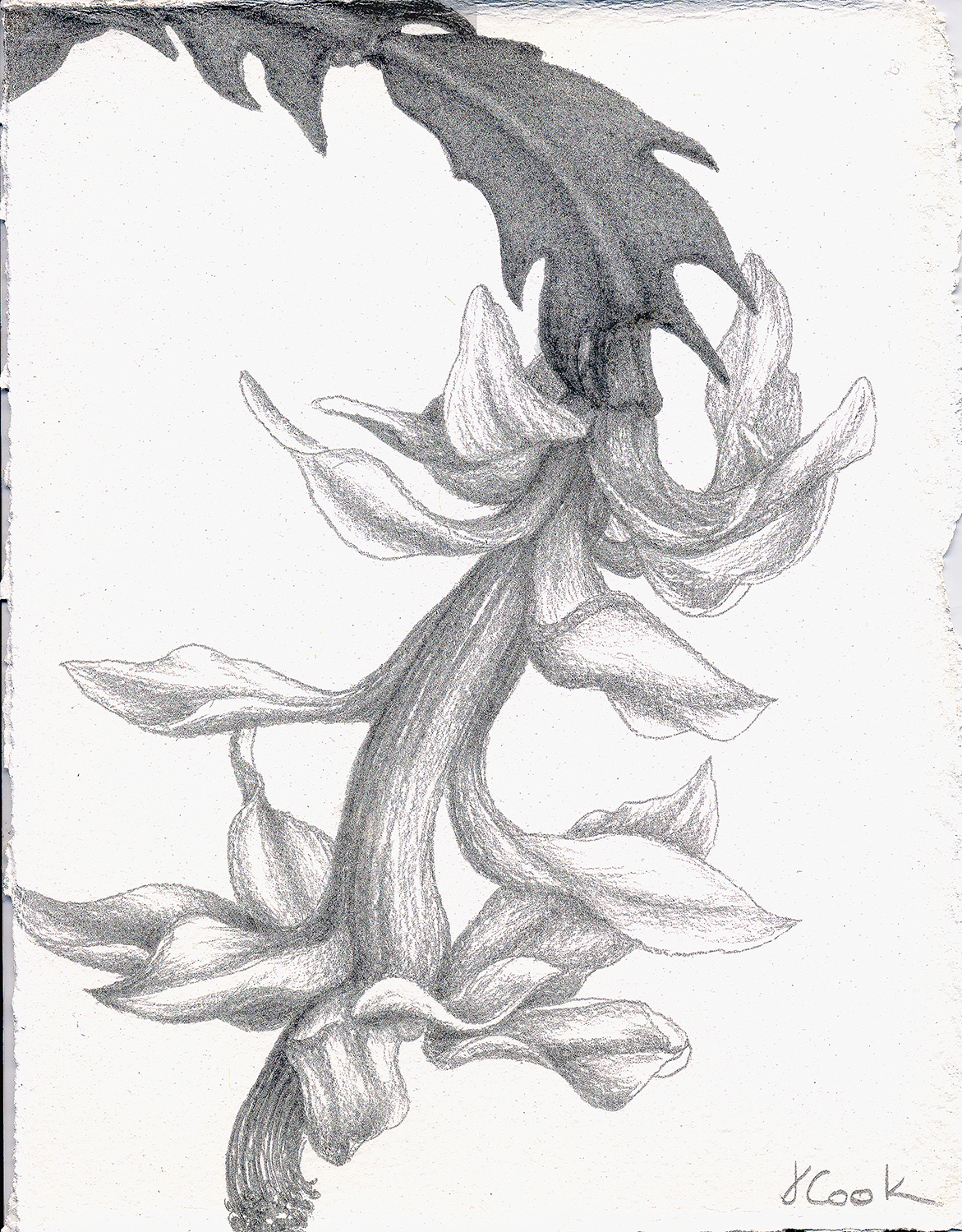
The Bend in the Creek, watercolour, Jeannine Cook artist
Nonetheless, I conclude that I am into the same unbelievably time-consuming colour adjustments that I endure with digital photographs. Somehow, even with the best settings possible, the scanner does not like that slightly rough paper surface and all sorts of odd colours appear. Pulling the work back to what it really looks like is almost a question of luck versus skill. It seems almost as labour-intensive as actually painting a watercolour, which is ironic. The image is a recent watercolour, The Bend in the Creek. It cost me too many hours of scanning adjustments!
I wonder if other watercolour artists have the same problems? These backroom aspects to art are definitely not my favourite pastimes, but are necessary in the business of art. Back to the old adage of there being "no such thing as a free lunch"!


